In SwiftUI, shapes are a powerful way to design custom user interfaces by defining basic geometry that can be reused, combined, and animated. While SwiftUI provides built-in shapes like Rectangle, Circle, and Ellipse, you can also create custom shapes to bring unique visual elements to your app. In this article, we’ll explore how to create custom shapes in SwiftUI and how to use them in your views.
Creating a Custom Shape
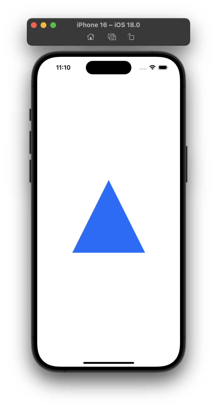
To create a custom shape in SwiftUI, you’ll need to define a struct that conforms to the Shape protocol. The Shape protocol requires the implementation of a single method called path(in: CGRect), where you define the path of the shape within a specified rectangle. Here’s an example of a simple triangle shape:
import SwiftUI

struct Triangle: Shape {
    func path(in rect: CGRect) -> Path {
        var path = Path()
        path.move(to: CGPoint(x: rect.midX, y: rect.minY))
        path.addLine(to: CGPoint(x: rect.maxX, y: rect.maxY))
        path.addLine(to: CGPoint(x: rect.minX, y: rect.maxY))
        path.closeSubpath()
        return path
    }
}
Triangle()
    .fill(Color.blue)
    .frame(width: 200, height: 200)
Animating Custom Shapes
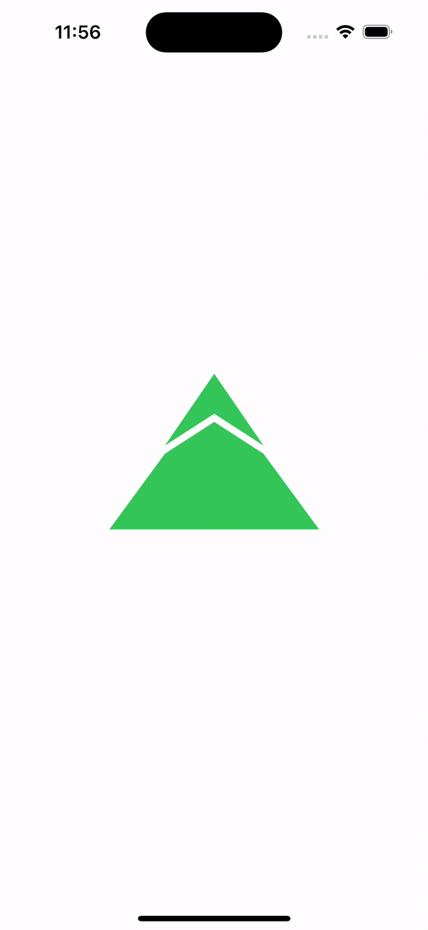
SwiftUI supports animations on custom shapes, making it easy to create dynamic effects. Let's take an example Shape from Apple's documentation article:
struct Mountain: Shape {

    var spacingScale: CGFloat

    var animatableData: CGFloat {
        get { spacingScale }
        set { spacingScale = newValue }
    }

    func path(in rect: CGRect) -> Path {
        let width = min(rect.width, rect.height)
        let height = width * 0.75
        let spacing = width * 0.030 * spacingScale
        let middle = width * 0.5
        let topWidth = width * 0.226
        let topHeight = height * 0.488

        return Path { path in
            path.addLines([
                CGPoint(x: middle, y: spacing),
                CGPoint(x: middle - topWidth, y: topHeight - spacing),
                CGPoint(x: middle, y: topHeight / 2 + spacing),
                CGPoint(x: middle + topWidth, y: topHeight - spacing),
                CGPoint(x: middle, y: spacing)
            ])

            path.move(to: CGPoint(x: middle, y: topHeight / 2 + spacing * 3))

            path.addLines([
                CGPoint(x: middle - topWidth, y: topHeight + spacing),
                CGPoint(x: spacing, y: height - spacing),
                CGPoint(x: width - spacing, y: height - spacing),
                CGPoint(x: middle + topWidth, y: topHeight + spacing),
                CGPoint(x: middle, y: topHeight / 2 + spacing * 3)
            ])
        }
    }
}
This shape takes the parameter spacingScale that will make our shape look different depending on its value.
On the other side, we added the computed property animatableData which will assign new animation values.
Then we just need to animate a @State property used as our custom Shape parameter:
struct ContentView: View {
    @State private var spacingScale: CGFloat = 0.5

    var body: some View {
        Mountain(spacingScale: spacingScale)
            .fill(Color.green)
            .frame(width: 200, height: 200)
            .onAppear {
                withAnimation(.easeInOut(duration: 1).repeatForever(autoreverses: true)) {
                    spacingScale = 2.0
                }
            }
    }
}
Be the first to comment