SwiftUI’s NavigationSplitView is a versatile view component that provides a multi-column navigation experience, making it easy to create layouts like sidebars or master-detail interfaces. With NavigationSplitView, building adaptive interfaces for iPad becomes straightforward, while also offering a responsive experience on iPhones.
Understanding Adaptive Behavior
As you can see in the Apple's Layout documentation, each device has different size classes, these can be regular or compacted and they will depend on the orientation.
NavigationSplitView will adapt to different size classes, showing different number of columns on iPhone, iPhone Max, iPad mini, iPad Pro...
In this article we'll show the examples on an iPad Pro 13 inch.
Creating a NavigationSplitView
The NavigationSplitView is a container that can display up to three panes, typically for:
- Sidebar: A sidebar or menu where users can select categories or sections.
- Content: A list of items or subcategories related to the primary selection.
- Detail: Usually displaying the details of the selected item.
You can display two or three columns:
Two columns
NavigationSplitView {
    Text("Sidebar")
} detail: {
    Text("Detail View")
}
Three columns
NavigationSplitView {
    Text("Sidebar")
} content: {
    Text("Content")
} detail: {
    Text("Detail View")
}
Adding Navigation and Selection
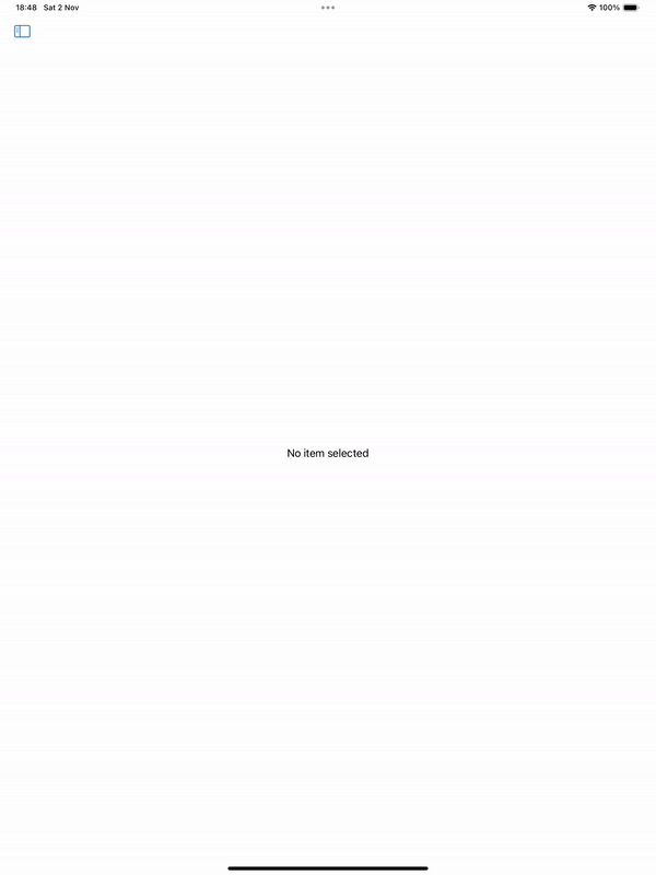
To make NavigationSplitView functional, let’s add a List with selection to a two-column NavigationSplitView:
import SwiftUI

struct Item: Identifiable, Hashable {
    let id = UUID()
    let name: String
}

struct ContentView: View {
    let items = [Item(name: "Item 1"), Item(name: "Item 2"), Item(name: "Item 3")]

    @State private var selectedItem: Item?

    var body: some View {
        NavigationSplitView {
            List(items, id: \.self, selection: $selectedItem) { item in
                Text(item.name)
            }
            .navigationTitle("Items")
        } detail: {
            if let selectedItem = selectedItem {
                Text("Details for \(selectedItem.name)")
            } else {
                Text("No item selected")
            }
        }
    }
}

#Preview {
    ContentView()
}
Be the first to comment